
Friday 10 February 2012
Feedback on Director's Commentary
Evaluation Comments for Director’s Commentary Evaluation Task 4
My Medicine – Natalya and Laura
Excellent and considerate understanding of the technologies used in production of the video. There are evident links between creative decision making and use of technology on both productions of the video using professional digital cameras (e.g focus pulls) and in the post production editing process – in discussion of continuity. This is sustained and thorough and accurate in discussion of the propaganda themes of the MV. The commentary shows a discrete awareness of the use of new media technology and uses discriminating examples really well. Excellent command of terminology and well presented.
Covers sound and technology. Exemplifies Photoshop well and the use of projection equipment and stop motion as an effect. Excellent commentary, well done.
Thursday 9 February 2012
Wednesday 25 January 2012
Saturday 14 January 2012
Thursday 12 January 2012
Task 1: In What ways do your media products use, develop or challenge forms and conventions of real media products?
To show the ways in which our music video utilises, develops and/or challenges the form and conventions of existing media texts I have chosen 6 stills from 'My Medicine'.

Firstly, this still conforms to the ultimate stereotypical band performance shot sononymous to rock music, in particular their music videos. The band shots are used to establish the members of the band and their location within the video. This is different from the more generic pop music video in which the focus is centered around the front man or woman, as an aspect of the male/female gaze their sex appeal is used in a promotional manner. Rock music videos are more focused upon the band due to a more instrumental and 'raw' star image many rock bands purvey. This image is further conforming to the stereotypes of the rock band set up, which consists of drummer at the center back, guitarists either side and the vocalist usually as the front of the frame. This is consist through many of the videos we researched including this still from the band VersaEmerge's music video (as shown below).


The next shot we chose subverts the dominant images within usual videos as it contains a video camera within the video. This was more of a plot device than a device of representation to show the singer and band creating their own propaganda, making the music video almost the perspective of the audience watching the propaganda. This helped build the narrative of the text.

This still to the left shows part of the abstract elements used within our music video. Abstract elements, albeit not used in all music videos are still contextually an existing convention within the rock genre, for example Radiohead's music video 'No Surprises'. However in our video this was our most powerful element; the images and readings being directly projected onto the character. This subverts more the more common ideology of music video as our abstract is pivotal with the narrative. They also related directly to the lyrics, in the case the pill and the lyric 'Somebody mixed my medicine'

The next still; a mid shot of the drummer mid performance, reflects a fundamental convention in rock music videos of the artists playing their instruments in sync with the track. This gives the illusion of the band playing in the music video. It is especially conformed to with rock music videos as the band are given a large amount of screen time for each member to establish their role and articulate their talent. This also acts as a promotional tool to some extent as each role or image represented for each band member can attract an audience, for example a particularly talented drummer shown within a music video can market the video towards the avid drummer and encourage them to watch it. Similarly an audience may begin to idolise a specific member and this can spark consumer debate over preference of band member generating more views and discussion of the video.

This still shows the narrative part of our music video which had the purpose of creating the storyline or stating the message. Music videos do not always tend to have narrative focus but instead are more reliant upon the abstract or performance shots. By creating our narrative that is a large focus of the video we challenged this stereotype. However the use of narrative within a music video is largely common within the rock genre, so it can be argued on the converse that this upheld the existing convention. Steve Archer comments that ‘Often, music videos will cut between a narrative and a performance of the song by the band. Sometimes the artist (especially the singer) will be a part of the story, acting as narrator and participant at the same time.' Our music video conforms to this fragmentation of character and narrative as our band members paradoxically flip between their state of work and their performance, a clear state of rebellion. To further this, we also used the singer as narrator and player in the video.
 This screen grab hi lights the more artist side to the music video, as a still projection. Keith Negus argues that the repetition of reoccurring thematic elements and generically specific iconography (one key element often being dominant and providing the skeletal structure for the promo) in music videos is commonly used. This applies to our music video from many different angles. For example, our consistent and frequent use of the projections show that are the basis of the video. However this can argued is not generically specific iconography as projections such as ours are largely unseen to those in other videos.

Negus statement could also be loosely applied to the consistent colour palette of our music video. We kept the performance and narrative schemes to be dark and plain by using dim lighting to contrast the upcoming bold and bright projections that would become almost a stylized motif. Albeit dim or darkened lighting is common within the more heavy genres of rock music videos we challenged the codes and conventions of using more bright clear lighting to show more detail and focus the audience in on the meanings and images of projections.
Wednesday 11 January 2012
Promotional Poster
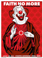
For our promotional poster we decided to do a tour style poster as our chosen genre's posters usually consist of either purely graphics with the tour dates in small print, for example Faith No More's The Second Coming poster as shown to the left or a performance image or iconic logo with large font tour dates, for example Muse's 2003 poster as shown to the right. We aimed more for Muse's approach of creating an iconic logo which will draw attention to the band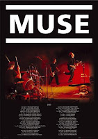

and poster therefore accentuating it as a promotional tool. Similarly, unlike the Faith No More poster, we wanted the tour dates to be clear as with an emerging new artist most revenue needs to be generated by people seeing that a new band is playing locally and checking them out out of curiousity. Another convention is to have almost a 'beauty' shot of the band with the logo and tour dates for example, the While She Sleeps poster as shown below left.

Our colour scheme was black, red and white in synchronisation with the black and red used on the digipak panels so therefore an audience could associate the two products easily and to help the continuity between all three of the products. Similarly we used the same font and logo used on the digipak.
We also used the still from our music video as the background image, which should also create an association as people who have seen the music video may recognise it and this may encourage them to buy the album or go to one of the tour dates.
Here is our end promotional poster:

Thursday 5 January 2012


Tuesday 13 December 2011
Tuesday 29 November 2011
Saturday 26 November 2011
Feedback
What has been blogged is very good and knowledgeable of the production of the music video - need more of it please! It is reflective and considerate posting of ideas, which are clearly well interpreted. Can you post the CD digipak? Well done.
Sunday 6 November 2011
Creating The Projections
After collecting these stock images and editing them on Photoshop as a group we took our own photos of eyes moving, blinking and looking panicked using shutter bursts. This meant we ended up with about 50 images per movement so that when put together in a sequence it created a jerky film look. I also created an animation of an abstract sequence of red and black flashing shapes for the abstract projection. After again editing these I put them into a sequence using Final Cut Pro to create small test sequences. All the images were given a tinge of red for continuity and to contrast the planned blue light to show the characters in the narrative.
Saturday 5 November 2011
Changes to Projection
Despite our enthuasiam towards our 'modern day propaganda' we decided that it would be too repetitive and wasn't leaving it open enough for the audience to find their own meaning and wouldn't create the images we want on the abstract part of the video. Therefore we decided to make it more abstract and straying away from propaganda towards subliminal messaging. We reserached subliminal messaging used in advertisments and the theory behind subliminal messaging, finding these two videos as examples of different types of subliminal messaging.
Obviously, we could not use an existing commercial with sulbiminal messaging as it has been decreed illegal in advertisement and films. Similarly, we could not creat effective subliminal messaging as this is illegal, but our projections for the abstract and narrative sequences would effectively be 'mock' subliminal messaging giving the impression of it. To tie this in with the image of the band; one of anti-establishmentism, almost anarchic we would center our projections around modern day topics. This is also the reason for the change from propanganda as we determined that propaganda is a less relevant topic to our target audience.
These projections would have to consist of mostly images as it is the most clear medium aside from text, but text is not interesting enough, frankly. The topics we would center them around would be the recesssion/economic state/riots, drugs/the health system, the glamourisation of death and sheer abstract brainwashing. Also in keeping with the lyrics of the song 'Somebody mixed my medicine, I don't know what I'm on' we would intersect the images with images of a pill to hopefully show that in some sense the media/projections have become the medicine.

Or in the true sense of subliminal messaging, the audience will not necessarily notice and go back to intepret the true meaning!
Friday 4 November 2011
Projection Ideas
In preparation for our shoot day, we had to decide what message we were going to convey to the audience by the projections we were going to project onto people. Originally our concept changed to cover the themes of propaganda. So we reserached modern day companies and found images in the style of war propaganda of the 50's. Some examples of this are below;


This would also add colour to our proposed mise en scene as the set is planned to be all black and this would stand out starkly and also highlight the narrative meaning the audience could see it clearly and interpret their own meanings from it.
This would also add colour to our proposed mise en scene as the set is planned to be all black and this would stand out starkly and also highlight the narrative meaning the audience could see it clearly and interpret their own meanings from it.
Tuesday 1 November 2011
Pre-Production Research.
With our concept we need to create projections to project on the people in the music video so I researched into videos that may affect people with montages of photos used. Instantly I found this video on youtube as an example of what we may use and perhaps the style we choose.
I really like this video as an idea for concept, except that perhaps we would not use text or show a different message but the collage is a perfect reference.
Similarly I considered a more abstract approach to the projects using patterns.
An example of this would be the perhaps stereotypical idea of the spinning optical illusion as shown in this video:
However this im,age is more commonly associated with brainwashing and as a group we have decided to avoid this approch.
Thursday 20 October 2011
Copyright Permissions
After sending the email shown in the previous post, surprisinglym we got a reply back from the record company;#

Wednesday 19 October 2011
Copyright Permissions For Track
To legally use this song our group would have notify thwe copyright holders of the track.
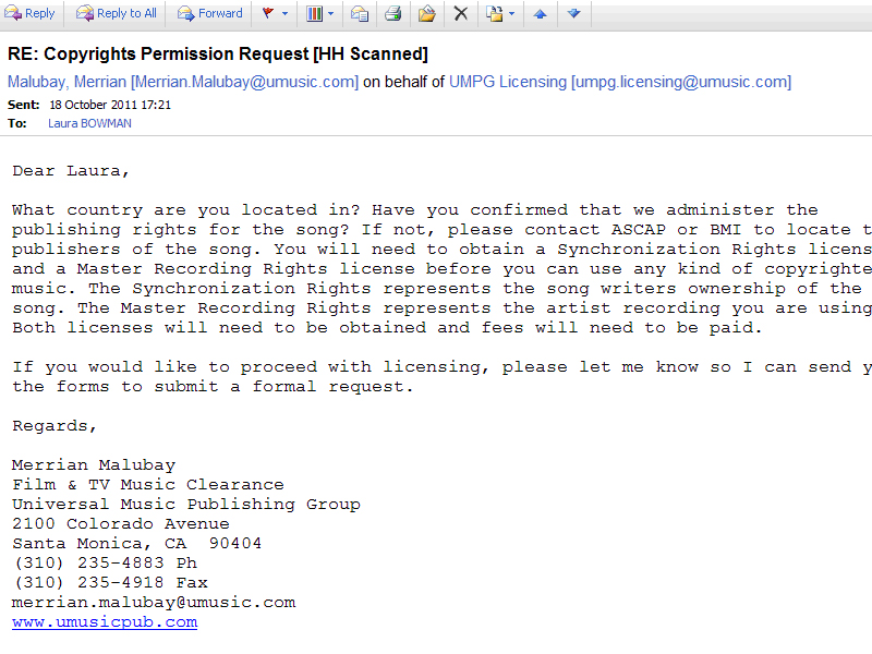
The original band, The Pretty Reckless are signed to Interscope Records, who are owned by Universal Music Group. Therefore we wrote an email to their licensing department as shown below:

The original band, The Pretty Reckless are signed to Interscope Records, who are owned by Universal Music Group. Therefore we wrote an email to their licensing department as shown below:

Tuesday 18 October 2011

Monday 17 October 2011

Friday 14 October 2011
Feedback
Good posts here - can you try and blog a couple of more by Monday (ps artwork is really cool!)

Monday 10 October 2011
Friday 16 September 2011
Research into My Ideas
I decided to research my cowboy themed ideas for the music video to see whether it could be developed or if there were similar ideas out there.
I found a great reference for the bright almost neon colour mix that I had originally imagined in My Chemical Romance's video for 'Na Na Na', however I was more drawn to the montage sequences which would be really applicable to the cowboy theme, for example the boxes could contain Boa, Python and perhaps reaction shots of the characters or shots of the band. Here is an example:

Unfortunately I also found that Muse have produced a video very similar idea to my concept for the Test Icicles track.
Knights Of Cyadonia Released in 2006.
Here is a screenshot from the video:

Tuesday 13 September 2011
Initial Ideas
When given the task of making a music video I initially thought of a themed video:
Band Name: Test Icicles
Track: Boa Vs Python
Genre: Indie/Electro/Rock/Punk
 The video would be set in a sort of neo-western cowboy setting . The video would start with the title inspired characters the Sheriff Boa and the stereotypical villain Python. However the video would be made in an almost comical light with bright colours and text overlays, for example to introduce the two characters. They would originally start in a bar playing cards where they challenge each other to a stand off at dawn. Obviously to make the video a green screen would have to be used for the stand off as location would be an issue but a set could be created for the bar setting. The band would be performing in the midst of the action perhaps using some stop motion techniques.
Here is the track:
Band Name: Test Icicles
Track: Boa Vs Python
Genre: Indie/Electro/Rock/Punk
Here is the track:
Saturday 10 September 2011
Introduction to Advanced Portfolio
After completing the first of the two year Media A Level course, the A2 year consists of two halves;
The first half relates to the Advanced Portfolio (Worth 100 points) which covers three things.
Firstly, we have been given the task of creating a music video to the song of our choice.
The others consists of a digipak containing an album cover design for the DVD release of the music video and a poster or magazine advertisment to promote the music video.
We have been 13 weeks to compltete this.
The second half relates to the exam Critical Perspectives in Media. This is also worth 100 marks and divided into
- Theoretical Evaluation of Production
- Contemporary media issues
Wednesday 30 March 2011
Thursday 10 March 2011
Wednesday 9 March 2011
Task 4: Who would be the Audience for your media product?
Our thiller will appeal to the target age group for most films 16-25 years of age. However, it may attract older fans of thrillers such as Seven as they have similar themes. It will probably appeal to a more male audience than women, so the main focus of our thriller was to appeal to men. We tried to make it appeal to them by casting a lead female who they may consider attractive and that may attract them to want to see our thriller. We also tried to put some action and mystery into our opening sequence by having the police team smash down the door and the Closed mystery surrounding the photos and how they were taken. The open ends left by our thriller should make the audience want to know the answers and therefore see the rest of the thriller. Blind Spot is also aimed more at an educated audience because as the main character, Jenna Smith, begins to unravel the mystery surrounding the photos, it become more complicated and this may be harder to follow for a less educated viewer.
Tuesday 8 March 2011
Task 3:What Kind of Media Institution Might Distribute Your Media Products?
I would suggest that Vertigo might produce our film.
Task 2: How does your product represent particular social groups?
 Our media product represents the social group of the working police. This is very common amongst thrillers and our thriller does conform to the stereotypical representation of the investigating units of the police as showing their struggle with the things they uncover whilst working on the force. We chose to represent them as the fairer more publicly concerned side of the force rather than the more manic justice obssessed police force in films such as the horror movie The Crazies in which they mindlessly follow orders in eliminating an 'infected' town. However we decided to represent this by giving the lead character of Jenna Smith a confliction to uncover the mystery of the photos for the benefit of society as many of the photos contain picture of the public unaware of the photos being taken. We chose not to represent their home lives and make it seem to the audience that they live to work as opposed to working to live a rich live outside their job. We also tried to challenge the stereotypical female ideal of staying at home looking after the kids and doing the housework. Jenna does not have children or a partner and the supporting male character who was played by Richard reverses the gender roles as he is less authoritative and more reliant on Jenna in a feminine way. We chose Karis to play this character as she looks quite small and fragile so that way when the audience arere shown to the character that Jenna's personality highly contrasts her looks and therefore, is more prominent. We based this around examples of existing powerful female characters in media today, such as Evelyn Salt in Salt (released in 2010) who stands up as a powerful female character, however is on the opposite side of the law to our character of Jenna Smith and does have a husband who she is worried for and leans on.
Thursday 10 February 2011


Saturday 5 February 2011


Tuesday 25 January 2011
Acccount of Shoot Day
To plan for our shoot for the thriller as a group we got together props, comprising if certain props were unavailable and set up our set. The set was built out of wooden boards for the walls and wooden floorboards for the flooring which was then partially covered by mock brick tiles to make the impression of a small, dingy flat in a rough part of town. However, this was different from our original plan which was to have dirty white walls and no windows but it overall turned out that it looked better than our original plan and created more interesting opportunities for shots. This did mean that we strayed away from our original storyboard which was to our benefit as in most cases it simplified the ideas and made the thriller storyline flow better. This overall created a better effect and made the shots seem more like a thriller as it created more suspense and showed more action.

The location was set in the studio, where the mock flat had been set up as it would be more practical than finding an actual flat that would be big enough to film in and have the right look to it. Also this gave us the opportunity to design our set how we wanted so we could make the set look like that of a thriller. To furnish the set we brought in two tables, a lamp, mattress and a light bulb which looked like it was hanging from the ceiling. This would attract our target audience of 16-25 years as having a creepy and so far unexplained setting would make them curious to see what the story is. We chose a few shots which highlighted the setting so that audience could clearly tell that this film would be a thriller. These included panning across a wall that we had covered in photos of people which were taken in their blind spot so they weren’t looking at the camera. This represented the genre as well as narrative because is gave the film a stalker effect. We also chose to use close-ups often as it would create an almost claustrophobic feel to the film. However the close ups were very mostly of the character Jenna, to establish that she is the lead character of the film.
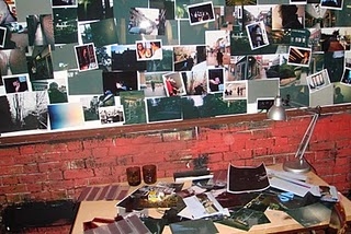 In terms of props we had a mattress, old cups, a bowl with some tea in to look like soup and some newspapers scattered on the floor. We decided to use all of these to give the impression of a grotty, lived-in flat whose owner did not care much for hygiene. This would all relate back to the thriller genre as this setting is quite common in the genre. Other props included handguns, torches and a shot gun. We decided to use these for the officers to hold to make it look realistic and as guns are almost synonymous to the thriller genre. The photos on the wall were another set of props, which we took and developed ourselves to make it look like the person who lives here was obssesive over them and it provides the mystery for our thriller. Costumes were black jumpsuits and worker boots for the officers and for the character of Jenna we chose a smart shirt, skirt, a grey blazer and heels. We wanted to make her seem feminine to juxtapose her more masculine personality traits. However we chose the colours grey, blue and black for her to look official and restrained.
We chose our cast to match this. Specifically Karis, who plays Jenna had the right image for the lead character, pretty on the outside but still could be seen as intimidating. The officers, Richard, Jack, Will, Rollo, and Niall were casted to look tough and intimidating, of which Richard was casted as the supporting role specificly because he looked the part the most of an officer who lives for his work but it not as harsh as he looks. However, we did doubt how the audience would portray their age and we decided to save these decisions until we started editing our thiller sequence.
 For lighting we kept it to a minimum for the main lights as we wanted to create the atmosphere of a dark, dingy home for the flat. Also it suggests that something isn’t quite right in the flat. We then added the pink light coming from the window to give the impression of the flat being situated in a back alley, perhaps with a dodgy club opposite. This would further the idea of the flat being situated in a bad area.
The location was set in the studio, where the mock flat had been set up as it would be more practical than finding an actual flat that would be big enough to film in and have the right look to it. Also this gave us the opportunity to design our set how we wanted so we could make the set look like that of a thriller. To furnish the set we brought in two tables, a lamp, mattress and a light bulb which looked like it was hanging from the ceiling. This would attract our target audience of 16-25 years as having a creepy and so far unexplained setting would make them curious to see what the story is. We chose a few shots which highlighted the setting so that audience could clearly tell that this film would be a thriller. These included panning across a wall that we had covered in photos of people which were taken in their blind spot so they weren’t looking at the camera. This represented the genre as well as narrative because is gave the film a stalker effect. We also chose to use close-ups often as it would create an almost claustrophobic feel to the film. However the close ups were very mostly of the character Jenna, to establish that she is the lead character of the film.
In terms of props we had a mattress, old cups, a bowl with some tea in to look like soup and some newspapers scattered on the floor. We decided to use all of these to give the impression of a grotty, lived-in flat whose owner did not care much for hygiene. This would all relate back to the thriller genre as this setting is quite common in the genre. Other props included handguns, torches and a shot gun. We decided to use these for the officers to hold to make it look realistic and as guns are almost synonymous to the thriller genre. The photos on the wall were another set of props, which we took and developed ourselves to make it look like the person who lives here was obssesive over them and it provides the mystery for our thriller. Costumes were black jumpsuits and worker boots for the officers and for the character of Jenna we chose a smart shirt, skirt, a grey blazer and heels. We wanted to make her seem feminine to juxtapose her more masculine personality traits. However we chose the colours grey, blue and black for her to look official and restrained.We chose our cast to match this. Specifically Karis, who plays Jenna had the right image for the lead character, pretty on the outside but still could be seen as intimidating. The officers, Richard, Jack, Will, Rollo, and Niall were casted to look tough and intimidating, of which Richard was casted as the supporting role specificly because he looked the part the most of an officer who lives for his work but it not as harsh as he looks. However, we did doubt how the audience would portray their age and we decided to save these decisions until we started editing our thiller sequence.
Saturday 1 January 2011
Sunday 12 December 2010
Wednesday 8 December 2010
Thursday 11 November 2010
What is a Thriller?
We have gone through the codes and conventions of a typical thriller and as a genre the audience has certain expectations. Certain themes are commonplace within thrillers, violence, action, mystery and an intricate story line which surprises the audience when the plot is unravelled. Through analysing semiotics, we
 discovered that all of these were present in the film The Usual Suspects.
Mise en scene is realistic in horror/thrillers and often composed of muted colours in terms of lighting and backgrounds. This is due to the focus on the characters, plot and their development. Costume often follows this trend but will sometimes be different to accentuate a character. For example, in The Usual Suspects Keaton wears a bright cream suit to make him stick out on the poster and to give the impression he the main character.
However, more common conventions of a horror/thriller are the inclusion of weapons such as guns and knives. There is usually blood in the films also.
 Moreover, the films usually include some sort of force, for example the police. There are many thrillers that are almost entirely based on this, for example the Bourne Identity, and its sequels. The Usual Suspects could be considered as this as the film is based around the interview of one small time criminal by the police in order to find out what really happened.
The differences between a horror and a thriller is that a horror is intending to scare the audience and make them feel uneasy, whereas a thriller is more like a mystery. However there are cases where these genres cross over into one film. An example of this would be I Am Legend, which follows the story of the last man in New York City after most of it's population has been 'infected' and turned into zombies.

Mise en scene is realistic in horror/thrillers and often composed of muted colours in terms of lighting and backgrounds. This is due to the focus on the characters, plot and their development. Costume often follows this trend but will sometimes be different to accentuate a character. For example, in The Usual Suspects Keaton wears a bright cream suit to make him stick out on the poster and to give the impression he the main character.
However, more common conventions of a horror/thriller are the inclusion of weapons such as guns and knives. There is usually blood in the films also.
The differences between a horror and a thriller is that a horror is intending to scare the audience and make them feel uneasy, whereas a thriller is more like a mystery. However there are cases where these genres cross over into one film. An example of this would be I Am Legend, which follows the story of the last man in New York City after most of it's population has been 'infected' and turned into zombies.
Tuesday 9 November 2010
Preliminary Filming Task Evaluation
My group were filming in the editing suite for our preliminary task. Even though this location was not our first choice we found that it worked as a setting as it reflected the gritty nature of the actors' perfomances and the idea that the focus was on the dialogue and the actors rather than the setting. In context, it became verisimiluted. I mostly took the role of director whilst filming, directing the type of shots, when we started and finished filming and whether we need to retake a shot.
In terms of lighting, we did not use any added lighting; only the lights in the editing suite however this lighting would be described as quite hard and light, as it is very bright in the studio and the light is colourless. This was not key to the scene however if the light had been dark then the expressions of the actors would have been less visible and the scene would have been less convincing. Also the harder light was more effective than if we had used soft lighting as the dialogue would have seeming a lot softer and there would be a lighter atmosphere, which was not our aim.
When setting up, we made sure that the tripod and camera were set up correctly, for example we bubbled the tripod to set the level so that the camera was level for the filiming. We also made sure each shot was framed correctly, however we did make a few mistakes with this, however they were not used for in our finished film. Also we were wary that our equipment was not seen in the background of shots however it can be seen in the reflection of a window in one of the shots. We also chose each shot carefully, for instance we used wide shots, two shots, and close ups. I was carefully to choose low angle shots to portray one character as having more power and status than the other. We also regarded the 180 degree rule and broke it specifically to make the scene less easy to watch, ie. the audience would need to concentrate.
Monday 8 November 2010
Editing the Preliminary Task
I had never edited before editing the Preliminary task so I found this a quite a challenge however I took an acitve part in the process. The first challenge was to master the use of Final Cut Pro, the editing programme that we are using. I learnt that clips of film are put into the Runs Bin which concsists of all the takes that were filmed and then we would sort through them to the ones we want to use and then move these to the Log Bin.
Wednesday 13 October 2010
Monday 11 October 2010
Introduction To Video Camera
Last week we began using the cameras and firstly we learnt how to set up the tripod so that we could have the camera at adjustable levels of height and angle. It would also be more steady than using handheld camera work. To adjust the height of tripod we twisted the nuts and raised the heights of each leg. We then locked the nuts once done. To adjust the tripod further we had to make sure the camera would first sit level on the top of the tripod. There is the equivalent of a built in spirit level on the tripod known to us as the 'bubble' so we would 'bubble' the tripod to set the spirit level straight. When putting the camera on we also had to make sure that the camera was locked in so it wouldn't fall off whilst filming. Once the tripod was set up and locked in, we learnt about the functions of the camera.
Firstly was the timecode. Every camera has a time code and it shows the time used filming. It counts in hours, minutes, seconds and then frames and in each second there are 25 frames but the time code only displays up to 24 as the next frame will be zero. It also helps during playback as you can take down the timecode of the exact shot and go back to it later.
We then learnt about white balancing. Every time the setting of a shot is changed (ie. going somewhere else to film it like another room) the white balance needs to be set. White balance sets the colours of the camera to match the white in the room so if it is not set the shot may be off color and look strange. To set white balance you zoom in on something white or a piece of blank paper so that the camera is only looking at the white object. You then press the white-balance button on the side of the camera and wait until it adjusts. When you see a number on the screen of the camera the white balance is set.
When zooming the camera we learnt the camera may not always be in focus. Focus determines how sharp a shot is, if not focussed then a shot will be blurry. So to focusthe shot zoom in on the subject and use the focus wheel on the front of the camera. Adjust it until focussed.
We also learnt about aperture. Aperture controls how much light goes into the camera and can be adjusted with the coordinating wheel on the front of the camera. All of these are operations of the cameras.
Next we discovered some camera skills including basic camera shots such as establishing shots which show the setting or character within a setting to establish the location of the film. Other types of shot include medium shot which shows the subject in some detail but still has the overrall view of them, close up which shows the subject in great detail and two-shot which is a shot that houses two subjects within a frame at a similar distance to a medium shot. How things are framed is also an important camera skills and we learnt about the rule of thirds; when a screen is divided into three both horizontally and vertically the square in the middle is the focus of attention so when framing a subject put the thing that you want to be focussed on in this square. Moreover when filming continuity editing must be considered as otherwise a film may end up out of order and confusing to an audience. To achieve temporal and spatial continuity you can use dissolves and fades when editing so that each shot moulds into the next however they cannot always be used so cutting through shots is used more. Another way to stop viewer disorientation is to use the 180 degree rule. This rule states that when filming the camera should not move more than 180 degrees around the subject. This keeps the action flowing but still gives space for different shots. The rule is sometimes deliberately broken to confuse the audience but more often the camera pans around enough to switch sides and keep the continuity intact and the 180 degree then applies again, but on that side.
We then moved on to practice filming by holding a practice shoot. This shoot was open to mistakes and we probably commited more than one of the 'Deadly sins of Filming' as shown below:
We also learn the industry terminology for a shoot, starting with the standby. When everyone is position for a take they call 'standby'. Next is Turn over or Roll Film (Rolling). This is called by the director and tells the camera operator to start filming. The few seconds that run before strating are known as the lead in and help the process of continuity editing. The cameraman thus responds with the same call to show that he is up to speed. The director then calls action, which is the cue for the actors and crew to start filming. Finally. when happy with the take, the director will leave a few seconds at the end, called Lead out and then call cut. This is the sign for the crew to stop the camera.
Sunday 3 October 2010
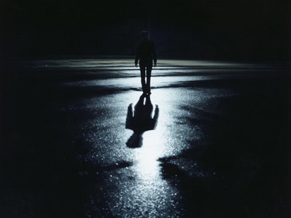
Thriller/Horror Mood Board
A mood board is a collection of images and other media forms to create an idea. My mood board for a thriller/horror would consist of these.
 Mirrors. Even though I don't have a phobia of mirrors, I still find them incredibly unnerving as however irrational it is, a reflection could morph into anything. Moreover, as shown in the photo, there could always be the possibility that your reflection has a mind of it's own. This idea has been exploited by the horror film Mirrors as people are killed by their own reflections.
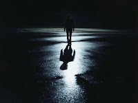 The fear of the dark concerns me and it's a potent idea for a thriller as it could be explored as what is hiding in the dark or how empty the dark is. Also, the fear of the dark is common and is quite a primal fear and this is often exploited by horrors and thrillers as its gives protagonists easy get aways and can scare and audience in many ways. For example, synchronous sound could portray something on a black screen that is there but the audience 'can't see'.

 The fear of the dark concerns me and it's a potent idea for a thriller as it could be explored as what is hiding in the dark or how empty the dark is. Also, the fear of the dark is common and is quite a primal fear and this is often exploited by horrors and thrillers as its gives protagonists easy get aways and can scare and audience in many ways. For example, synchronous sound could portray something on a black screen that is there but the audience 'can't see'.
Wednesday 29 September 2010
Tuesday 28 September 2010
Photography Composition and Image Manipulation
Photography brings a visual language that is universal in understanding. We must then understand its vocabulary which consists of shapes, textures, patterns, lines, colours, shade of light to dark and sharp to blurry images. Just as we must learn to arrange words in a coherent order in order to make sense when we write or speak, so too must we put visual elements together in an organized manner if our photographs are to convey their meaning clearly and vividly.
Composition means arrangement: the orderly putting together of parts to make a unified whole; composition through a personal, intuitive act. However, there are basic principles that govern the way visual elements behave and interact when you combine them inside the four borders of a photograph. Once we have sharpened our vision and grasped these basic ideas of principles, then we will have the potential for making our photographs more exciting and effective than ever before.
In Photoshop, we learnt how to manipulate images to create new posters. Originally, we were given a series of film posters to play around with including Cloverfield, 30 Days of Night, Easy Rider, The Sarah Connor Chronicles and Crank. We learnt how to cut and paste images into others, create new layers in photoshop document and how to use the clone tool. We were also taught how to change the colour of a layer of image so that it would match with the rest of the image, therefore creating a seamless transition between the new layer and the background. Our task was then to take the poster for the film Cloverfield and to edit out all of the writing, insert a person from another poster so that they would match the colours of Cloverfield and finally, create a reflection of them in the water. I chose a lady from the Bad Boys poster and edited her into the Cloverfield poster.
I found using photoshop easy as the tools are logical and pretty straight forward. It is also useful for desgining posters and other media products for this reason and is ideal for making things such as DVD covers.
About Myself
My name is Laura Bowman and I decided to take AS Media at Hurtwood because in the past I took part in some small student videos and I wanted to find out how to create a proper film. Before coming to Hurtwood to study I was at Queen Annes School, mainly studying drama. However, I am more into music, specifically rock, classic rock and heavy metal. I like alot of bands but my current favourites are Disturbed, Suede, Deftones and Bring Me The Horizon.
As well as listening to music, most of my free time is spent watching films, the last film I saw at the cinema was Knightr and Day but out of all the films that I've seen at the cinema the best for me would have to be Inception. It was a thriller about the world of dreams, and was similar to another film starring Leonardo Di Caprio, Shutter Island which was also centered on confusion of reality.
I don't have a favourite film of sorts but I my preference is towards thrillers, action films and sci-fi but one of my best films in the horror genre is Hannibal and in terms of TV Drama I enjoy Taggart and most other murder mystery programmes.
Subscribe to:
Posts (Atom)