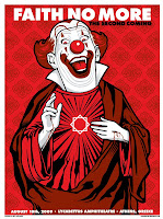
For our promotional poster we decided to do a tour style poster as our chosen genre's posters usually consist of either purely graphics with the tour dates in small print, for example Faith No More's The Second Coming poster as shown to the left or a performance image or iconic logo with large font tour dates, for example Muse's 2003 poster as shown to the right. We aimed more for Muse's approach of creating an iconic logo which will draw attention to the band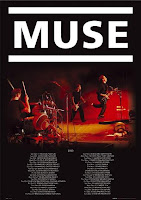

and poster therefore accentuating it as a promotional tool. Similarly, unlike the Faith No More poster, we wanted the tour dates to be clear as with an emerging new artist most revenue needs to be generated by people seeing that a new band is playing locally and checking them out out of curiousity. Another convention is to have almost a 'beauty' shot of the band with the logo and tour dates for example, the While She Sleeps poster as shown below left.

Our colour scheme was black, red and white in synchronisation with the black and red used on the digipak panels so therefore an audience could associate the two products easily and to help the continuity between all three of the products. Similarly we used the same font and logo used on the digipak.
We also used the still from our music video as the background image, which should also create an association as people who have seen the music video may recognise it and this may encourage them to buy the album or go to one of the tour dates.
Here is our end promotional poster:

No comments:
Post a Comment