Tuesday, 13 December 2011
Tuesday, 29 November 2011
Saturday, 26 November 2011
Feedback
What has been blogged is very good and knowledgeable of the production of the music video - need more of it please! It is reflective and considerate posting of ideas, which are clearly well interpreted. Can you post the CD digipak? Well done.
Sunday, 6 November 2011
Creating The Projections
After collecting these stock images and editing them on Photoshop as a group we took our own photos of eyes moving, blinking and looking panicked using shutter bursts. This meant we ended up with about 50 images per movement so that when put together in a sequence it created a jerky film look. I also created an animation of an abstract sequence of red and black flashing shapes for the abstract projection. After again editing these I put them into a sequence using Final Cut Pro to create small test sequences. All the images were given a tinge of red for continuity and to contrast the planned blue light to show the characters in the narrative.
Saturday, 5 November 2011
Changes to Projection
Despite our enthuasiam towards our 'modern day propaganda' we decided that it would be too repetitive and wasn't leaving it open enough for the audience to find their own meaning and wouldn't create the images we want on the abstract part of the video. Therefore we decided to make it more abstract and straying away from propaganda towards subliminal messaging. We reserached subliminal messaging used in advertisments and the theory behind subliminal messaging, finding these two videos as examples of different types of subliminal messaging.
Obviously, we could not use an existing commercial with sulbiminal messaging as it has been decreed illegal in advertisement and films. Similarly, we could not creat effective subliminal messaging as this is illegal, but our projections for the abstract and narrative sequences would effectively be 'mock' subliminal messaging giving the impression of it. To tie this in with the image of the band; one of anti-establishmentism, almost anarchic we would center our projections around modern day topics. This is also the reason for the change from propanganda as we determined that propaganda is a less relevant topic to our target audience.
These projections would have to consist of mostly images as it is the most clear medium aside from text, but text is not interesting enough, frankly. The topics we would center them around would be the recesssion/economic state/riots, drugs/the health system, the glamourisation of death and sheer abstract brainwashing. Also in keeping with the lyrics of the song 'Somebody mixed my medicine, I don't know what I'm on' we would intersect the images with images of a pill to hopefully show that in some sense the media/projections have become the medicine.

Or in the true sense of subliminal messaging, the audience will not necessarily notice and go back to intepret the true meaning!
Friday, 4 November 2011
Projection Ideas
In preparation for our shoot day, we had to decide what message we were going to convey to the audience by the projections we were going to project onto people. Originally our concept changed to cover the themes of propaganda. So we reserached modern day companies and found images in the style of war propaganda of the 50's. Some examples of this are below;


This would also add colour to our proposed mise en scene as the set is planned to be all black and this would stand out starkly and also highlight the narrative meaning the audience could see it clearly and interpret their own meanings from it.
This would also add colour to our proposed mise en scene as the set is planned to be all black and this would stand out starkly and also highlight the narrative meaning the audience could see it clearly and interpret their own meanings from it.
Tuesday, 1 November 2011
Pre-Production Research.
With our concept we need to create projections to project on the people in the music video so I researched into videos that may affect people with montages of photos used. Instantly I found this video on youtube as an example of what we may use and perhaps the style we choose.
I really like this video as an idea for concept, except that perhaps we would not use text or show a different message but the collage is a perfect reference.
Similarly I considered a more abstract approach to the projects using patterns.
An example of this would be the perhaps stereotypical idea of the spinning optical illusion as shown in this video:
However this im,age is more commonly associated with brainwashing and as a group we have decided to avoid this approch.
Thursday, 20 October 2011
Copyright Permissions
After sending the email shown in the previous post, surprisinglym we got a reply back from the record company;#

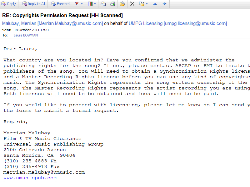
Wednesday, 19 October 2011
Copyright Permissions For Track
To legally use this song our group would have notify thwe copyright holders of the track.
The original band, The Pretty Reckless are signed to Interscope Records, who are owned by Universal Music Group. Therefore we wrote an email to their licensing department as shown below:

The original band, The Pretty Reckless are signed to Interscope Records, who are owned by Universal Music Group. Therefore we wrote an email to their licensing department as shown below:

Tuesday, 18 October 2011

Monday, 17 October 2011

Friday, 14 October 2011
Feedback
Good posts here - can you try and blog a couple of more by Monday (ps artwork is really cool!)

Monday, 10 October 2011
Friday, 16 September 2011
Research into My Ideas
I decided to research my cowboy themed ideas for the music video to see whether it could be developed or if there were similar ideas out there.
I found a great reference for the bright almost neon colour mix that I had originally imagined in My Chemical Romance's video for 'Na Na Na', however I was more drawn to the montage sequences which would be really applicable to the cowboy theme, for example the boxes could contain Boa, Python and perhaps reaction shots of the characters or shots of the band. Here is an example:

Unfortunately I also found that Muse have produced a video very similar idea to my concept for the Test Icicles track.
Knights Of Cyadonia Released in 2006.
Here is a screenshot from the video:

Tuesday, 13 September 2011
Initial Ideas
When given the task of making a music video I initially thought of a themed video:
Band Name: Test Icicles
Track: Boa Vs Python
Genre: Indie/Electro/Rock/Punk
 The video would be set in a sort of neo-western cowboy setting . The video would start with the title inspired characters the Sheriff Boa and the stereotypical villain Python. However the video would be made in an almost comical light with bright colours and text overlays, for example to introduce the two characters. They would originally start in a bar playing cards where they challenge each other to a stand off at dawn. Obviously to make the video a green screen would have to be used for the stand off as location would be an issue but a set could be created for the bar setting. The band would be performing in the midst of the action perhaps using some stop motion techniques.
Here is the track:
Band Name: Test Icicles
Track: Boa Vs Python
Genre: Indie/Electro/Rock/Punk
Here is the track:
Saturday, 10 September 2011
Introduction to Advanced Portfolio
After completing the first of the two year Media A Level course, the A2 year consists of two halves;
The first half relates to the Advanced Portfolio (Worth 100 points) which covers three things.
Firstly, we have been given the task of creating a music video to the song of our choice.
The others consists of a digipak containing an album cover design for the DVD release of the music video and a poster or magazine advertisment to promote the music video.
We have been 13 weeks to compltete this.
The second half relates to the exam Critical Perspectives in Media. This is also worth 100 marks and divided into
- Theoretical Evaluation of Production
- Contemporary media issues
Wednesday, 30 March 2011
Thursday, 10 March 2011
Wednesday, 9 March 2011
Task 4: Who would be the Audience for your media product?
Our thiller will appeal to the target age group for most films 16-25 years of age. However, it may attract older fans of thrillers such as Seven as they have similar themes. It will probably appeal to a more male audience than women, so the main focus of our thriller was to appeal to men. We tried to make it appeal to them by casting a lead female who they may consider attractive and that may attract them to want to see our thriller. We also tried to put some action and mystery into our opening sequence by having the police team smash down the door and the Closed mystery surrounding the photos and how they were taken. The open ends left by our thriller should make the audience want to know the answers and therefore see the rest of the thriller. Blind Spot is also aimed more at an educated audience because as the main character, Jenna Smith, begins to unravel the mystery surrounding the photos, it become more complicated and this may be harder to follow for a less educated viewer.
Tuesday, 8 March 2011
Task 3:What Kind of Media Institution Might Distribute Your Media Products?
I would suggest that Vertigo might produce our film.
Task 2: How does your product represent particular social groups?
 Our media product represents the social group of the working police. This is very common amongst thrillers and our thriller does conform to the stereotypical representation of the investigating units of the police as showing their struggle with the things they uncover whilst working on the force. We chose to represent them as the fairer more publicly concerned side of the force rather than the more manic justice obssessed police force in films such as the horror movie The Crazies in which they mindlessly follow orders in eliminating an 'infected' town. However we decided to represent this by giving the lead character of Jenna Smith a confliction to uncover the mystery of the photos for the benefit of society as many of the photos contain picture of the public unaware of the photos being taken. We chose not to represent their home lives and make it seem to the audience that they live to work as opposed to working to live a rich live outside their job. We also tried to challenge the stereotypical female ideal of staying at home looking after the kids and doing the housework. Jenna does not have children or a partner and the supporting male character who was played by Richard reverses the gender roles as he is less authoritative and more reliant on Jenna in a feminine way. We chose Karis to play this character as she looks quite small and fragile so that way when the audience arere shown to the character that Jenna's personality highly contrasts her looks and therefore, is more prominent. We based this around examples of existing powerful female characters in media today, such as Evelyn Salt in Salt (released in 2010) who stands up as a powerful female character, however is on the opposite side of the law to our character of Jenna Smith and does have a husband who she is worried for and leans on.
Thursday, 10 February 2011


Saturday, 5 February 2011


Tuesday, 25 January 2011
Acccount of Shoot Day
To plan for our shoot for the thriller as a group we got together props, comprising if certain props were unavailable and set up our set. The set was built out of wooden boards for the walls and wooden floorboards for the flooring which was then partially covered by mock brick tiles to make the impression of a small, dingy flat in a rough part of town. However, this was different from our original plan which was to have dirty white walls and no windows but it overall turned out that it looked better than our original plan and created more interesting opportunities for shots. This did mean that we strayed away from our original storyboard which was to our benefit as in most cases it simplified the ideas and made the thriller storyline flow better. This overall created a better effect and made the shots seem more like a thriller as it created more suspense and showed more action.

The location was set in the studio, where the mock flat had been set up as it would be more practical than finding an actual flat that would be big enough to film in and have the right look to it. Also this gave us the opportunity to design our set how we wanted so we could make the set look like that of a thriller. To furnish the set we brought in two tables, a lamp, mattress and a light bulb which looked like it was hanging from the ceiling. This would attract our target audience of 16-25 years as having a creepy and so far unexplained setting would make them curious to see what the story is. We chose a few shots which highlighted the setting so that audience could clearly tell that this film would be a thriller. These included panning across a wall that we had covered in photos of people which were taken in their blind spot so they weren’t looking at the camera. This represented the genre as well as narrative because is gave the film a stalker effect. We also chose to use close-ups often as it would create an almost claustrophobic feel to the film. However the close ups were very mostly of the character Jenna, to establish that she is the lead character of the film.
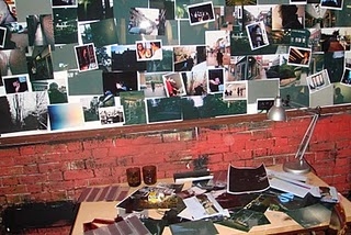 In terms of props we had a mattress, old cups, a bowl with some tea in to look like soup and some newspapers scattered on the floor. We decided to use all of these to give the impression of a grotty, lived-in flat whose owner did not care much for hygiene. This would all relate back to the thriller genre as this setting is quite common in the genre. Other props included handguns, torches and a shot gun. We decided to use these for the officers to hold to make it look realistic and as guns are almost synonymous to the thriller genre. The photos on the wall were another set of props, which we took and developed ourselves to make it look like the person who lives here was obssesive over them and it provides the mystery for our thriller. Costumes were black jumpsuits and worker boots for the officers and for the character of Jenna we chose a smart shirt, skirt, a grey blazer and heels. We wanted to make her seem feminine to juxtapose her more masculine personality traits. However we chose the colours grey, blue and black for her to look official and restrained.
We chose our cast to match this. Specifically Karis, who plays Jenna had the right image for the lead character, pretty on the outside but still could be seen as intimidating. The officers, Richard, Jack, Will, Rollo, and Niall were casted to look tough and intimidating, of which Richard was casted as the supporting role specificly because he looked the part the most of an officer who lives for his work but it not as harsh as he looks. However, we did doubt how the audience would portray their age and we decided to save these decisions until we started editing our thiller sequence.
 For lighting we kept it to a minimum for the main lights as we wanted to create the atmosphere of a dark, dingy home for the flat. Also it suggests that something isn’t quite right in the flat. We then added the pink light coming from the window to give the impression of the flat being situated in a back alley, perhaps with a dodgy club opposite. This would further the idea of the flat being situated in a bad area.
The location was set in the studio, where the mock flat had been set up as it would be more practical than finding an actual flat that would be big enough to film in and have the right look to it. Also this gave us the opportunity to design our set how we wanted so we could make the set look like that of a thriller. To furnish the set we brought in two tables, a lamp, mattress and a light bulb which looked like it was hanging from the ceiling. This would attract our target audience of 16-25 years as having a creepy and so far unexplained setting would make them curious to see what the story is. We chose a few shots which highlighted the setting so that audience could clearly tell that this film would be a thriller. These included panning across a wall that we had covered in photos of people which were taken in their blind spot so they weren’t looking at the camera. This represented the genre as well as narrative because is gave the film a stalker effect. We also chose to use close-ups often as it would create an almost claustrophobic feel to the film. However the close ups were very mostly of the character Jenna, to establish that she is the lead character of the film.
In terms of props we had a mattress, old cups, a bowl with some tea in to look like soup and some newspapers scattered on the floor. We decided to use all of these to give the impression of a grotty, lived-in flat whose owner did not care much for hygiene. This would all relate back to the thriller genre as this setting is quite common in the genre. Other props included handguns, torches and a shot gun. We decided to use these for the officers to hold to make it look realistic and as guns are almost synonymous to the thriller genre. The photos on the wall were another set of props, which we took and developed ourselves to make it look like the person who lives here was obssesive over them and it provides the mystery for our thriller. Costumes were black jumpsuits and worker boots for the officers and for the character of Jenna we chose a smart shirt, skirt, a grey blazer and heels. We wanted to make her seem feminine to juxtapose her more masculine personality traits. However we chose the colours grey, blue and black for her to look official and restrained.We chose our cast to match this. Specifically Karis, who plays Jenna had the right image for the lead character, pretty on the outside but still could be seen as intimidating. The officers, Richard, Jack, Will, Rollo, and Niall were casted to look tough and intimidating, of which Richard was casted as the supporting role specificly because he looked the part the most of an officer who lives for his work but it not as harsh as he looks. However, we did doubt how the audience would portray their age and we decided to save these decisions until we started editing our thiller sequence.
Saturday, 1 January 2011
Subscribe to:
Posts (Atom)